Memo Review
A quieter system for distinguishing art without competing with it
Focus Areas
Editorial design, publication systems, art direction
Execution
Editorial concept, grid system, typography, image pacing, print detailing
Description
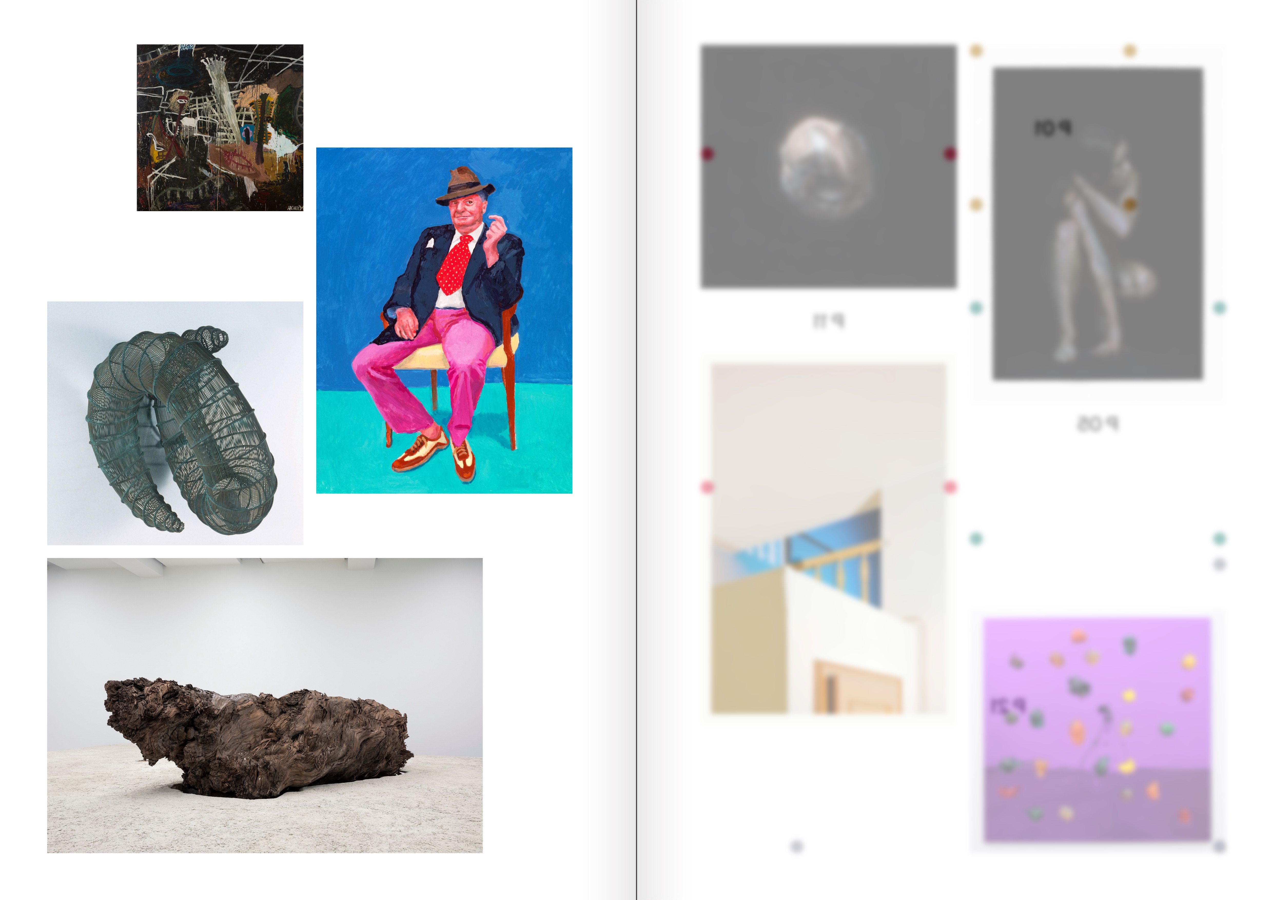
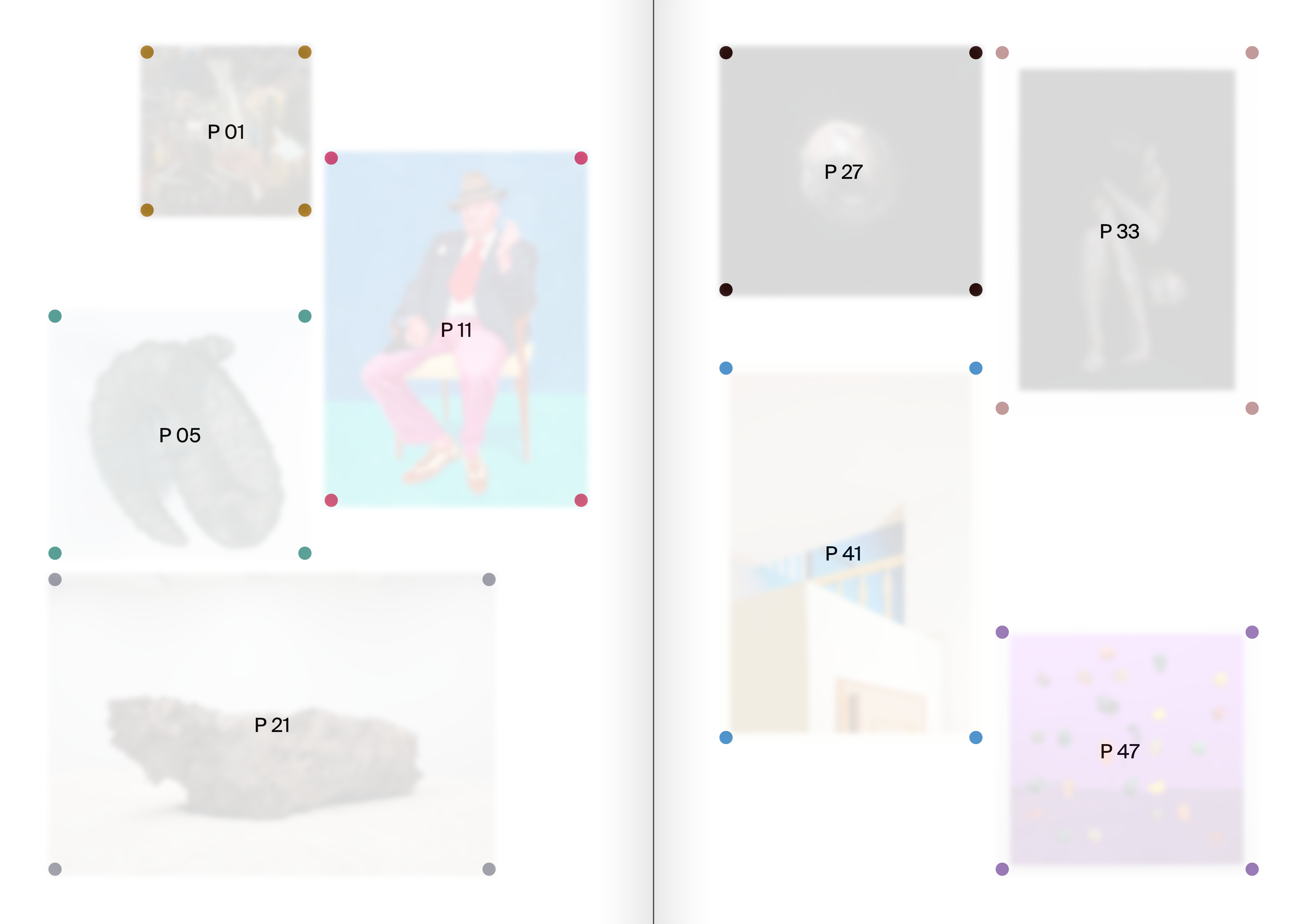
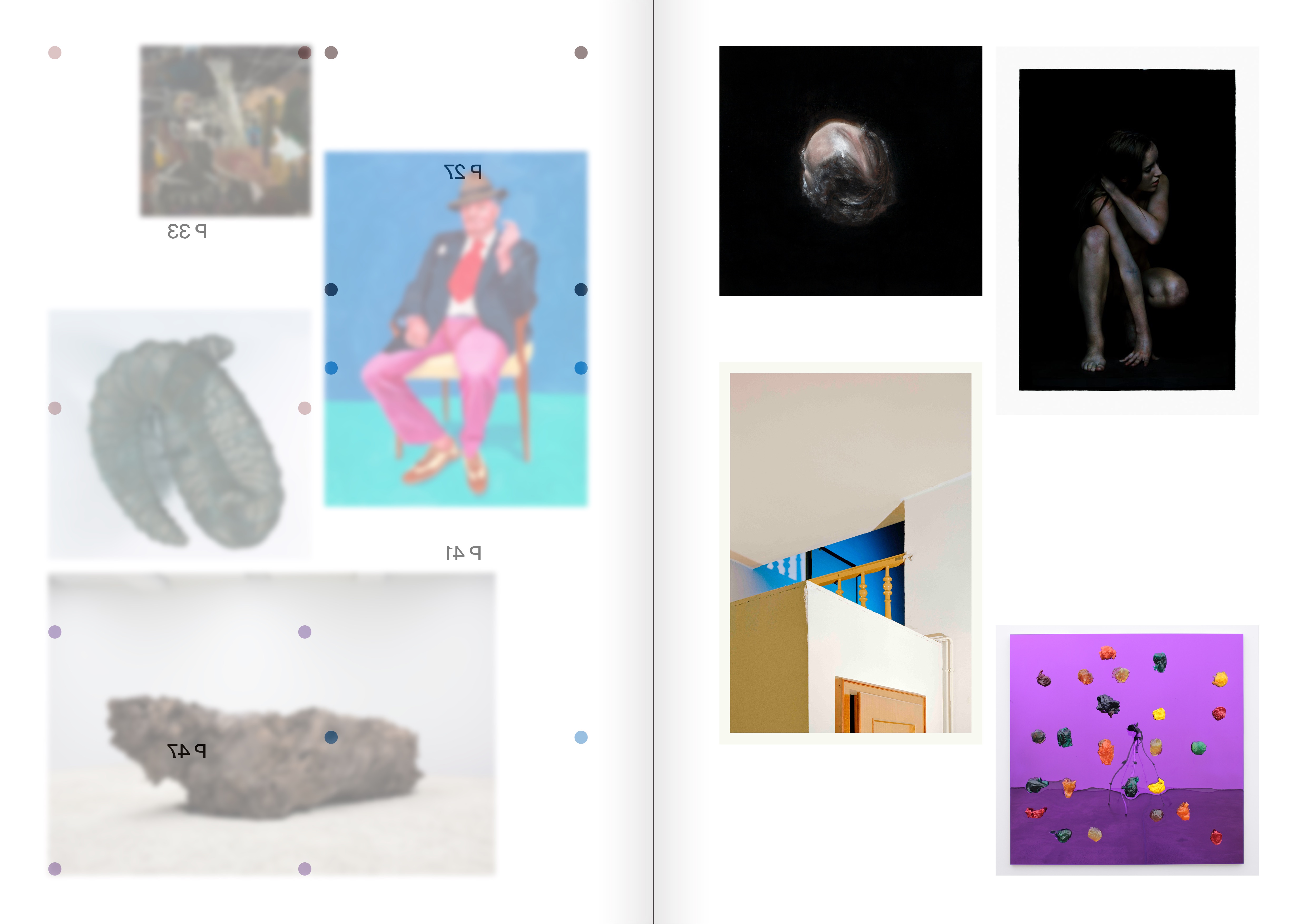
This project starts from a simple tension: how do you give an art periodical its own identity without disturbing the neutrality that lets the work speak? Memo Review uses a sparse editorial system of colour, typography, and page rhythm to distinguish artists and sections without crowding the work itself. What emerges is a periodical identity built on light touch rather than graphic dominance.